To build upon my initial idea and see if it would be feasible i decided to pitch my initial idea to the class, presenting it by an animatic and the comments of the class are as follows.
Overall i found that the sequence of the misinterpreted crime should be altered to a mugging as this and build up the suspicion of the narrative.
However the initial concept of a so called illegal exchange could work, as when i comes to the editing stage, effects can be added such as a darkened aesthetic. Or generally play around with the cinematography using the vast catalog that final cut express 4 has to offer.
The narrative appears clear and easy to follow, also the twist at the end doesn't appear to baffling.
Two comments were made involving the aspects of the costume.
Everyone else involved in the film could be dressed in various super-hero costumes so that appears the norm. It would also feel a bit more like a short film, as they are renown to have normal situations with one aspect tweaked.
Have the character dress in normal clothes, and everyone else in outfits, so the protagonist stands out and is against the norm.
To make the narrative tie into the various comic book references, it was suggested i use no dialogue and instead insert text boxes in the corner of each frame as well as using speech bubbles. To give it that graphic novel style i could also wash out the colour palette and perhaps only focus upon a certain colour such as red. Finally slightly pixelated images could be used to give it that hand drawn style.
A film noir style could also be used to give a more gritty urban feel if the scene were to be set in a city.
I found from thi,s that the idea I have come up with could work very well and with development, could allow my idea to turn out well
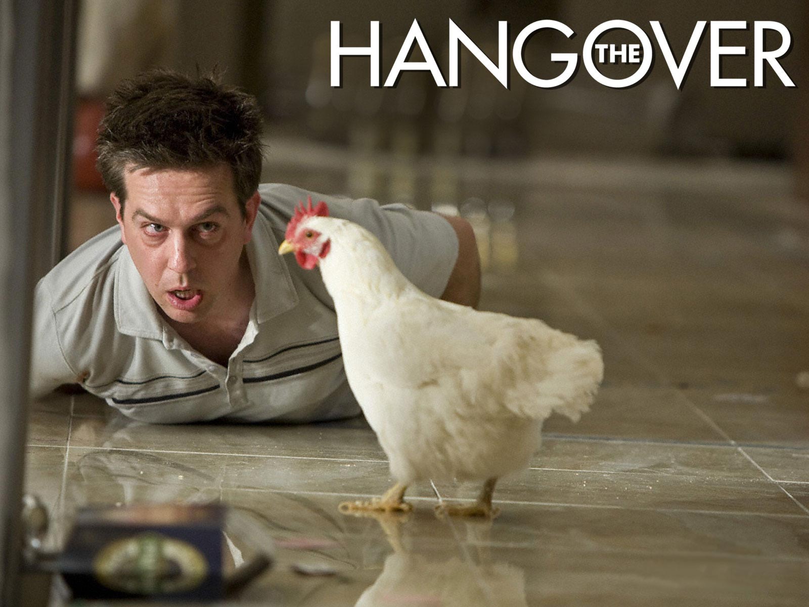
To brush up on my analytical skills I was set the task of deconstructing a teaser trailer for a film and a short film. The film that I opted to study briefly was ‘The Hangover’. At the beginning of the film the major production logos appear and from the names of the company’s mentioned(Warner Brothers and Legendary Pictures) you can clearly denote that the movie is going to be based on a high budget and will most probably be a box office success. However throughout the rest of the trailer the names of the cast aren’t mentioned, but I think these weren’t included as this was one of the first trailers and the cast was rather low key and for many of the actors this was their first major role. Par Bradley Cooper who made an appearance in Wedding Crashers. Before you get to see any of the footage you hear a diegetic phone ring which signifies that the first scene of the trailer will most probably involve a phone based conversation between two characters. It then progresses into the trailer showing two characters engaged in a phone call with the topic of the conversation having large amounts of narrative enigma. This enigma begins when the male character breaks the news to the female character that her husband to be (Doug) has gone missing; this then poses the question, who is this character? And how did he manage to get separated and lost? During the opening few seconds of the trailer the camera shots tend to be a variety of close-ups and extreme close-ups to emphasize both of the characters emotions towards the situation, giving the preferred reading that this was a stag do gone wrong and that the narrative will most probably be based around getting this character back.
In the next scene of the trailer a non- diegetic editing effect is used to provide exposition on the situation, with the message two days earlier displayed, signifying that something has caused a disruption in the narrative equilibrium to result in the loss of the character Doug. It then switches back to the trailer showing another male character who was shown in the background during the phone call to be laid on the floor, with the camera being placed on a high angle to make him appear more vulnerable. In the same frame there is also a rooster/cockerel,which provides an intertexual reference to the early morning wake up call giving anchorage towards the time of day. As well,as this product placement occurs in the form of a ‘Monster Energy’ drinks can which signifies that the setting is most probably America as this is predominantly an American based product (he tiger placed in the bathroom can be seen as an intertextual reference to Las Vegas due to the mirage hotel is home to the white tigers who partake in a magic show).The accents of the characters and there dress sense provides further anchorage to the setting and nationality of the characters, this being the most popular nationality to use in films as it appeals to a vast audience and the accent is recognisable world wide.
Use of the quote ‘What did we do last night’ signifies that the characters have no recelation of their past events which is a creative method to reveal the plot as the audience have the narrative revealed to them at the same time as the characters. As well as this it creates the preferred reading that the characters underwent a form of activity such as drinking which cause this memory loss. At this stage of the trailer your unaware of where in America the film is set, you have a vague idea that its in the desert however this isn’t accurate enough anchorage and the characters are in a hotel in this area. However with the use of exposition shots, being set in the style of neon lights, it gives the impression of Las Vegas which Is later revealed to be the setting.
From watching the trailer you are given a preferred reading that the film is a comedy, yet this can be contested with there being elements of adventure. This is put across to the audience wit the choice of editing styles in terms of music and camera shots.Convential and creative shots are used to give variety to the trailer such as over the shoulder shots for conversations and the shot when the character missing a tooth looks into the mirror. with this rapid style of editing, it shows that the target audience is the youth market, as its seen as more entertaining and has more youth based themes.
The trailers soundtrack is light hearted ,up beat and fast in tempo(to set the pace of the trailer). It’s also non-orchestral, so no long drawn strings as tension is not needed to be created. In the second half of the trailer the non-diegetic music switches to a power ballad,(by Phil Collins which may be another intertextual reference as one of the main male characters is called Phil)which builds up to, the punch, which is diegetically over emphasized, with this and the use of Mike Tyson in the scene it could possibly be creating an intertextual reference to Las Vegas’s boxing history. Or maybe a new equilibrium forming in the narrative after the character that got punched caused the baby to get hit by the car door (karma). Again narrative enigma occurs, posing the question this time why is Mike Tyson in the room, why did he punch one of the male protagonists and how did he get into the room. Its expected that there would be high amounts of narrative enigma as this is a teaser trailer, as its used to entice the audience to see the film as they will want to know the answers to the gaps in the narrative.
Another way that the audience is drawn in further is with the inclusion of the directors past success hit of ‘Old School’, the inclusion of this information will draw in fans of the film itself and admirers of the comedy style. Throughout this deconstruction of this trailer I’ve been referring to several male protagonists and not named a central protagonist, this is because from watching the trailer the main character appears to be missing and the entire group is shown though out the trailer.
If the commutation were to be applied, would the film have the same affect if the main characters were all female, stereotypically females don’t tend to be as outrageous as men when is comes to pre wedding events therefore in my opinion I feel the narrative may have been a bit more tamer so not to offend.
So to summarise what I interpreted from the clip, the name of the film signifies the narrative, which I found easy to pick up on from watching this clip. Its basically several middle aged American men on a stag do in Las Vegas, which goes terribly wrong due to an excess consumption of alcohol. This causes them to lose the groom, the wife finds out and the film is based around retracing their steps to find out what events they underwent to achieve their goal of finding the groom and getting him to his wedding on time.
As its distributed on You Tube by Future Shots its clearly not expected to be a high budget movie.
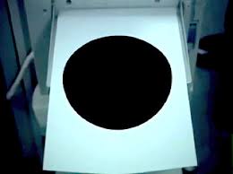
Binary opposition with the white writing and black screen, as well as the name being in white ‘The Black Hole’ and the background being black.
Uses a black hole to enter the sequence, which is an innovative and creative editing style.
Mid shot – shows characters depressed expression and lazed body posture, with this and the use of a sigh your able to denote that the character is depressed in his current scenario.
Creative and original framing with the over the hand shot.
Setting is a stereotypical office job
Scene appears grey and dark to reflect the characters mood.
Narrative enigma, where does the dot appear from and what does it do????
Non-diegetic sc-fi sounds denote that there is some form of disturbance in the narrative.
Photocopier acts as a reference for the heartbeat speed.
Use of CGI so clearly not such a low budget production.
Gradual zoom upon the door to focus on what the character see’s.
Binary opposition occurs with the characters emotion, going from secluded and depressed to intrigued and greedy.
Increase of non-diegetic sound creates tension build up to when he gets locked in the safe.
Zoom out in ellipse (time lapse)show clear cut jumps in time, partnered with a zoom out in each cut.
Constant setting
Slight Dutch tilt, signifying something will go wrong.
Product placement with the snickers
Narative enigma, why is he by himself and does he get out of the safe alive?????
Portrays message that greed can get the better of you.
Intertextual reference to the saying curiosity killed the cat.
Fast paced editing, represent the target audience – youth.
Shot reverse shot to show perspective from in the black hole.
Commutation test would it have the same affect if say the central protagonist was a child or a female?
Use green banner to show American specified age range.
Titles give an edgy electronic feel, which signifies genre of the film will most probably be a sci-fi film.
Male has quite a rough accent, which portrays the stereotypical tough guy.
Due to themes of the trailer you can sense the age range will be a 12-15 certificate.
Exposition is created by the date and the font used for this text signifies a futuristic setting.
With the inclusion of a desert landscape and fire you can denote a theme of war emerging.
Non-diegetic musics lyrics exposes the narrative. Also the genre of this music taps into the industrial theme which links back to the theme.
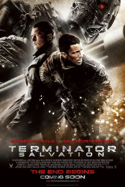
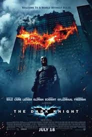
Christian Bale is emphasized upon to draw in fans of his.
Futuristic vehicles create various similitude, so the audience can believe setting.
Use intertextual reference with teh use of a motor bike chase, linking to recent hits such as Star Trek, The Dark Knight and Transformers 2. It also links to one of the most famous scenes from Terminator 2.
Use a tag line that is familiar to fans of the original series.
The first thing to appear in the trailer is a cyborg, allowing fans to immediately recognise the film.
Use minor key non-diegetic to create a sinister mood.
Production companies logos are altered to look more gritty and grim by darkening them and adding more shades of grey. This creates a darker feeling towards the film.
Use of an orange filter is present to make the scene appear more cheery and happy.
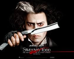
Style of the trailer is typical of Tim Burton.
Use the names of Producers, Directors e.t.c to break up the scene.
Fog can denote London in the past.
Font used is a sharp serif style, which anchors the genre which is a drama and refers to the blades which are a key aspect to the narative.
Various shots are used of Jonny Dept to reiterate that he is the central protagonist.
Elliptical editing is used to show clear cuts over time.
Inclusion of Sasha-Baron Cohen to draw in a further audience.
Diegetic titles are original and the graffiti style text helps to anchor the setting, which is an urban area.
Due to what is going on, on-screen the continuous long shot doesn't appear tedious.
Over the shoulder shot proves key during the conversation and provides conventional structure. As well as this it helps to break up the scene.
Close ups are used to show necessary details.
One continuous setting is used throughout which is typical of a low budget short film.
Background colour scheme of red and white could represent binary opposition.
Good use of tracking shot to follow characters motion.
The central protagonist isn't given away until the end of the film when the same character engages in the same situation.
As you reach the end of the clip the variation in shot types becomes more diverse.
A flat camera angle is used during the handshake.
Stereotypes of gangs in sense if dress, way that the engage in dialogue and the handshake that they are par taking in. To go further into this the accents of the characters is American so LA may be the proffered setting.
Dress sense used helps to anchor the times period which the short film is set in.
Also the non-diegetic sound throughout is hip hop/rap, which is stereotypically associated with the gang type persona's.
Creative in how the diegetic aspects of the clip set the pace of the clip, for example the the medical drip. This also helps to anchor the setting of a hospital or some form of medical establishment.
Binary opposition is used in terms of the non-diegetic music and the narrative. What's appearing in the scene is disturbing however the music played over the top is light and relaxing. Created via the use of major keys being played.
There appears to be a contested narrative which I picked up on. You as a viewer have the impression that this man laying in a hospital bed is attempting to pull the plug on himself, yet ends up killings the patients next to him. Therefore the audience can decide whether this was accidental or purposeful.
From the narrative, a sense of narrative enigma arises. In that that the audience will want to know why the character is in hospital?
Lack of dialogue is an impressive technique used to create suspense.
Use stereotypical deep male voiceover to give a contested reading.
Voiceover then switched to central protagonist whom is more light hearted and comical.
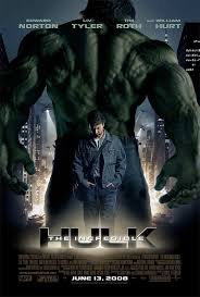
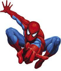
Uses inter textual references to Spiderman and various other superheros, partnered with what appear to be going on in the frame you can depict the genre is a spoof.
Innovative camera work, using car wing mirror to reveal the character.
Over exaggerated injuries and accidents.
High octane, non-diegetic soundtrack which will appeal to the target audience of youths.
Include what else the director has been involved in will draw in fans (directed Scary Movie and Naked Gun, theses films help to anchor the genre of the film), as well as this fans of the inter textual references will be interested.
Use editing sequence similar to Spiderman trilogy.
Acclaimed actor.
Fits with my narrative in how he tries to help someone, yet it then results in the character failing. For example when he attempts to save an old woman from an on coming vehicle, yet in doing so creates for danger for the female character.
No one seems to react differently when he is in a superhero costume.
Use pop culture comedy that a vast audience can relate to.
High angles a integrated to show the vulnerability to the giant iPod.
Linking text scenes have inter textual references, which are then shown in the next few seconds of the trailer.
Again, there is light hearted non-diegetic music, However a more intense build up is used at to establish the trailer, creating an oppositional reading.
Animation uses captions instead of words. This makes the audience able to decide what the characters personas should be like. As well as this it makes the viewers more aware of what is occurring in the scene.
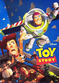
Presented in a childish collage style, to denote the target audience ( young children who have not seen the film or didn’t understand the narrative when they watched it). Hence why the film has been condensed into a three minute clip.
Quite advanced editing effects are used to say it’s a short film e.g the use of a realistic explosion. Also with the film being presented via the use of illustration it will have been time consuming.
Narrative plays on the idea of how you remember the film when you first saw the big screen production.
Director describes the clip as a ‘crazy’ summary by a child who was just seen the film for the first time.
Original framing using car mirror to make the characters the focal point of the frame.
Stereotypical situation that most can relate to. With the brother, sister rivalry scenario.
Comedy used in quite crude, so would most probably appeal to a slightly older audience of around 15-34. Older or younger than this may take offense from the topics.
This piece will be recognisable due to its made by Ardman Animation, so fans of their past productions e.g. Wallace and Gromit will be interested in this piece.
Dutch tilt is incorporated to signify something is not right.
Gritty aesthetic makes the production more socially realistic.
High aspects of contrast are used to improve the visual quality.
Binary opposition between characters, with one being tall and the other being short. So tall character is emphasized upon more.
Sign on the fence is not in English nor is the setting or the race of the characters. With it being set in the desert and the characters are dressed in military style clothing it signifies the modern day conflict issues in the Middle East. Therefore as a viewer you would get the expectation that conflict will most probably occur.
Diegetic sound track provided by a radio plays a key role, it aids in building up suspense with the commentators on the radio using the phrase ‘you can feel the tension’.
Binary opposition is reiterated and the sense of conflict. Using football team names and then a long shot to reveal the opposing duo who have engaged in conflict denotes the opposing team that is being referred to on the radio.
During the stand off radio says ‘are any of these teams going to take it now’. This helps to build the tension further.
Close ups are used to reveal emotion.
Use of ‘first to shoot first to score’ implies that someone out of the four soldiers are going to engage in combat.
Soldiers shoots due to the wrong reason, because of a goal that was offside.
Establishing shot pans over the city, with the Chrysler building creating exposition of the New York setting.
Bright lights to fade out scene.
Full of inter textual references with the film being based upon a comic book.
Throughout the trailer waves are used to create emotion.
Editing is set to fit with the beat.
1st person shot is used when showing the mind set of the symbiotic creatures mindset.
Binary opposition is used for the character of Spiderman. With him having a duel identity of him being Spiderman and Peter Parker. As well as this there is opposition between the good and evil persona's of the man character.
Costume is used as editing an editing technique, allowing fans of the super hero to instantly recognize the film.
Interesting transitions, by zooming right into the character Venoms mouth the cut to the next scene.
Marvel logo- fans can know the film is going to be a comic book based production.
Fast paced adrenaline pumping non-diegetic music.
Use popular culture e.g myspace for publicity.
During explosion sequence no sound is used.
Creative camera shot. Focussing on a handheld camera screen, which is watching the central protagonist , it then zooms out to reveal what was being captured on the handheld camera.
Use elaborate costume.
Scene where Tony Stark is undergoing some form of metal working process links with the name of the film.
Non-diegetic soundtrack Iron Man by Black Sabbath
Credits are presented in the style of a ironmonger , to relate to the name of the film.
(In both Spiderman and Iron Man costume is crucial to making the character, who they are.)
Use split screen to show the characters alternative motives.
Simple title sequence - Plain white text overlying the footage.
Binary opposition shown by the split screen. In how one side of the screen life is fine, yet on the other everything is going wrong.
Captivating how characters are able to interact with each other. For example the character on the left screen throws an apple which hits character on the right. Also use of the door to make the characters switch sides. On the right the character opens the door , resulting on the character on the left being pushed into the frame on the right by the opening door. Yet the fortune of the characters doesn't change as a result of the switch.
Slow motion help to emphasize each characters emotion, and seen as the scene has many things going on slowing the speed of the frame down allows the audience to be able to take everything in.
Quirky time lapse (elliptical editing). In the sense how everyone one around the central protagonist are moving at around triple speed where as they male character appears to have been slowed down.
1st person shot is used to navigate around a shopping centre which picks out a certain character. Helping the audience distinguish the central protagonist.
Use Biblical references signifying that religious issues will be involved in the narrative.
White background throughout, so it creates a constant sense of narrative enigma. As the audience isn't aware of how the character got into this setting.
Non-diegetic soundtrack creates tension, due to the use of long drawn out strings.
180 degree rule is used, so not to break the boundaries of believability.
Close ups are used to emphasize key aspects that influence the characters decision.
Interesting how the screen splits into four, which then reveals the same character revealing a new peice of dialogue in each frame.
Voice overs are effective in the sense of how they are synced perfectly when using the female characters.
Off screen violence is used, which is more effective that showing it on screen as it allows the viewer to imagine it themselves. Making an assumption once they hear a gun shot.
Use monochromatic effect, only showing the colour red, which may be an inter textual reference to Sin City.
Intriguing twist- How one male character has a gun to another males head for some period of time, you would then expect him to then shoot this character. Yet another character who you appear to forget about appears back in the frame and kills the male with the gin to end the scene.
Also the plot is actually explained during the opening sequence over a phone call, but the sound is drowned out by diegetic sounds, so your unaware of the full situation.
Deadline
Clear exposition, which is provided by specific time and places, which helps to anchor the setting.
Fast paced editing and quite over the top narrative makes for easy viewing.
Elliptical editing used shows the character getting more aggravated over time.
Low angles are used to make the main character appear bigger and more powerful just before he punches the other male character.
Similar to most short films, it doesn't seem to boast the awards that's its won, as they aren't included during the end credits.
As well as this another common trend it follows is that the cast are not emphasized, this could be for two reasons. Firstly the actors won't be well known so advertising them wont aid in drawing an audience. And secondly it will concentrate the audience on the narrative.
A female voice is used for the short voice over, which is a counter stereotype to the stereotypical deep male voice you mind in most large budget movie trailers.
Non-diegetic soundtrack is responsible, as its the soundtrack from the original television series.
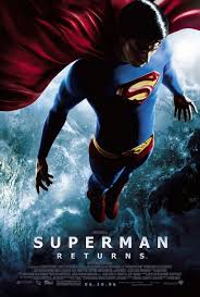
High and low angles are used though out to represent certain characters as weak and vulnerable, or super imposed and powerful.
Inter textual phrase is used so audience know that the film is Superman.' Is it a bird, is it a plane........'
Each candidate will evaluate and reflect on the creative process and their experience of it. Candidates will evaluate their work electronically. The format of the evaluation has some flexibility and its form can be negotiated between teacher and student: it may take place with individual candidates or with the production group as a whole, or each individual candidate or production group may make a formal or informal presentation to the whole class.
The questions that must be addressed in the evaluation are:
In what ways does your media product use, develop or challenge forms and conventions of real media products?
How effective is the combination of your main product and ancillary texts?
What have you learned from your audience feedback?
How did you use new media technologies in the construction and research, planning and evaluation stages?
Ideas for the format for the presentation of the evaluation can be found in the Guidance Notes.
Level 1 0–7 marks
There is minimal understanding of the forms and conventions used in the productions.
There is minimal understanding of the role and use of new media in various stages of the production.
There is minimal understanding of the combination of main product and ancillary texts.
There is minimal understanding of the significance of audience feedback.
There is minimal skill in choice of form in which to present the evaluation.
There is minimal ability to communicate.
There is minimal use of digital technology or ICT in the evaluation.
Level 2 8–11 marks
There is basic understanding of the forms and conventions used in the productions.
There is basic understanding of the role and use of new media in various stages of the production.
There is basic understanding of the combination of main product and ancillary texts.
There is basic understanding of the significance of audience feedback.
There is basic skill in choice of form in which to present the evaluation.
There is basic ability to communicate.
There is basic use of digital technology or ICT in the evaluation.
Level 3 12–15 marks
There is proficient understanding of the forms and conventions used in the productions.
There is proficient understanding of the role and use of new media in various stages of the production.
There is proficient understanding of the combination of main product and ancillary texts.
There is proficient understanding of the significance of audience feedback.
There is proficient skill in choice of form in which to present the evaluation.
There is proficient ability to communicate.
There is proficient use of digital technology or ICT in the evaluation.
Level 4 16–20 marks
There is excellent understanding of the forms and conventions used in the productions.
There is excellent understanding of the role and use of new media in various stages of the production.
There is excellent understanding of the combination of main product and ancillary texts.
There is excellent understanding of the significance of audience feedback.
There is excellent skill in choice of form in which to present the evaluation.
There is excellent ability to communicate.
There is excellent use of digital technology or ICT in the evaluation.
Evaluation
Throughout the majority of the school year I have undergone the coursework segment of the A2 media course. In my personal opinion I felt it was slightly rushed and hectic, due to my poor time keeping and other issues. Therefore if given the opportunity I would plan my time more wisely, to achieve the highest quality from my ability. So if any additions needed to be made I would have more time to do so, however I feel it could have gone a lot worse, and considering this was my first solo production I think I have done my self proud.
In what ways does your media product use, develop or challenge forms and conventions of real media products?
Gaining an insight into the common occurrences used in short films, was one of the first tasks I underwent during the coursework. And throughout my own short film I have tried to work towards these, but not in a way that ticks every stereotype.
Unlike trailers, names don't tend to be included throughout, as the majority of short films have a either a low key or unknown cast. So taking this on board I added all these details into a diegetic credits sequence at the end of the film. I did this so that the audience are able to absorb the narrative, instead of being bombarded by cast names they will never have heard of.
Characters themselves are based highly upon counter types and inter textual references. The choice of persona for each character was crucial to gain the desired effect. Clearly the central protagonist is based highly upon Spiderman, due to his choice of attire. But instead of the character being portrayed as a stereotypical male who is tough, gets the girls and beats up the bad guys. Instead binary opposition occurs, as he is portrayed as a total counter type. As a guy, who wakes up with another in his bed, gets beaten up by a Caucasian middle class gangster and is afraid of heights. I tried to incorporate this into all of my characters, to bring a sense of comedic value to my short film. (From looking back at my final cut you could say that the central protagonist has a slight inter textual reference to the Stig, due to the way he reacts to some situations.) As I have briefly mentioned the countertype American gangster who infact is British and Caucasian. With this set of character types I hoped to appeal to a youth audience spanning from 15 to 34 years of age. By labelling my film with a 12 age certificate, A larger market can be branched out to. To make sure that my text is easy to interpret I avoided complex sentence structure, opting for a more informal approach. Ideally avoiding dialogue if possible, as it may accidentally provide an oppositional or contested reading.
Locations
With this being a small scale A2 project, I was working from my own pocket, so I had to scout out all of the locations myself. Unlike glossy Hollywood blockbuster I wasn't looking for something breathtaking and exotic. Instead I was searching for a backdrop that almost blends in. One that interlinks with the narrative but doesn't cause the audience to be drawn towards it. Throughout all of this I am attempting to achieve a sole selling point, which I think most short films also do. This is having the narrative as the focal point, and from watching back my final cut and seeing reactions on a personal level I feel I have done so.
Effects
In terms of computer genreated effects (CGI) in short films, I have expanded upon the common codes and conventions of having very little amounts of these effects and editing techniques. Having the Sin City effect towards the end of the film, is that main use of these techniques. This effect used in Frank Millers adaptation will have cost millions to achieve the finished product. However I was able to recreate this with no added cost using merely Final Cut Express and on line tutorials.
Sin City
Tutorial using Final Cut Express
Example of footage from my film
The main aim of this was to mimic the graphic novel aesthetic of Sin City, to signify my own films comic book reference . However going further into detail, it also has a polysemic meaning. In the sense that all of the colour and happiness is gradually being drained from the protagonists life. Which eventuallyfades out towards the end of the film.
Example of colour fade out
Distribution
Having looked into this on my AS project and further more in A2, there is only a small array of options available for a short film maker on an extremely low budget.
However I could aim towards one of the major British film companies. To get my project onto the big screen I would first preview a screening for free at a local film festival,this would most likely be Leeds. Where I would gain access to feedbackfrom a vast audience , at a next to nothing cost. If my film were to go down well, and I were to gain recognition, I could incorporate this as further advertisement and publicity.Warp X the low budget film company would be my pro choice of companies to work with, as one of the five main conglomerates would not be achievable at my level of film. I would choose this company as it would allow me to produce my film on a higher budget, perhaps gaining access to local cinemas to screens for regional viewings. Following in the footsteps of other low budget movies such as Billy Elliot, which produced on a $5,000,000 budget grossed a $87,285,000 worldwide gross profit.
If this were to fall through, or just to gain additional distribution I would aim towards specialist television channels such as Propeller Tv, On Sky, channel 195. Which is a company established to support the short film industry.
Soundtrack
This was created by a fellow peer, who is currently undertaking the A-level music course at my school.The music in my piece is designed to create desired emotions, a technique used in both short films and trailers. However from listening to the tracks several times I have found them to be quite catchy. Which if my film were to become a success, would be an additional selling point, which many mainstream film use.
Track 1 - Morning Scene : Gives a sense that the character is relaxed, but ready to start the day and no-thing is wrong, however when the track drops the narrative alters, providing deposition that the situation is going to develop. And with the use of mild bass slight tension is created, but not enough to displace the audience.
Track 2 - Travel Scene: This track uses a male voice over with a predominant accent to give a heavy urban feel, also it appears rather gritty and hard hitting with the use of heavy bass. The tempo of the track allows this area of the short film to flow well.
Track 4 - Corridor: Proffered reading of this track, is to give a heavy
sense of displacement and confusion. This is achieved via a heavy,
fast paced base line that increases the heart rate. To mimic the
protagonists reactions in the audience.
I personally feel that I haven't followed the conventions of a short film, in the sense that I didn't capture enough interesting shot types. Granted I took plenty of footage and when placed it together it worked well.
In certain areas of my film I have added footage where feedback has been given. Re shoots were possible, but due to cast commitments not everything was achieved. But there are certain subtle aspects I have included into my short film. Certain set dressing is used to portray gender types. The use of a guitar and darts board denotes the masculinity, where as the South Park figure gives more of a comedic camp aspect. Also creating a reference as its an animated character which has a fantasy aspect. The window in the bedroom sheds through large amounts of light during the opening scene, to denote that the outside world is a surreal place.
Another cinematic touch I have added is during the shot focussed upon the protagonists arm. During this I lined it up with the street markings to almost give a sense that a web should come out in this direction. As well as this it also links into the direction that the character moves next.
Narrative
I feel it is typical in the style of most short films. I took a normal everyday scenario, getting up and going into town, but slightly altered one element. This being the fact that the central protagonist thinks he is Spiderman, but not the hero you would expect. Instead you get someone who is weak and vulnerable, both mentally and physically. Without the costume the narrative would be no were near as effective. As without it the audience wouldn't be able to relate properly to the film.
Tag line
Tag line to my film is heavily influenced by my main intertextual reference whichis Spiderman. From hearing or reading the line 'No dignity, No shame, No powers' it paints a rough outline of the narrative. Yet it still creates some narrative enigma to draw in an audience, in the sense that they will ask what this relates to and what exaclty the main character will be doing.
The line itself is actually a play on the Scary Movie tag line, 'No mercy No shame No sequel'. Which is also relevant as I have researched a great deal into the film and used it as the basic concept of my own idea.
How effective is the combination of your main product and ancillary texts?
In comparison to the time I designated for editing the ancillary tasks were rather rushed, as they had to be completed in tandem with the editing process and other school comitments. But the final products I am left with are highly effective and due to that I am reasonably pleased.
Whilst doing all of these tasks simultaneously it gave me the advantage that everything would link easier, as all the information would be fresh in my mind. This was crucial as they all need to be tied together, otherwise in terms of advertising it wouldn't appear clear that both of the texts are linked to my film.
For my magazine there are several techniques that I used. The company name 'Comic Com', was strategically chosen to link in with the themes of the article and the film itself. So not to appear overly confident and egotistical as it signifies that I am able to pick flaws in my own work and take on board criticism. I incorporated still s from the actual film to give a glimpse into my film for those yet to see and to provide something to relate to for those you have.
Throughout both ancillary texts I used a relatively similar colour pallet, this being red and black. As these are the primary colours related to Spiderman. The poster follows this, but is based more towards an Scary Movie intertextual reference. The concept of having several characters abusing the protagonist was my initial idea. However the casting for my film was minimal, so I opted to have the main character sat by himself in centre frame. The image I used was independently taken ( not a screen shot from the movie ), as this seemed to be more creative. Plus it allows the audience to view a range of images related to my film, instead of being bombarded by similar movie stills. Plus there are no great opportunities I feel a screen shot could have been used.
BBFC rating for my film has been added to my poster and was classified into its designated 12 age certificate using the placement criteria from the BBFC website.
At first I used an American rating symbol as it matched with the colour scheme of my poster, however it didn't appear accurate. As my film has a much larger chance of being distributed throughout the UK rather than the US. The image of the character is to show that the he is trapped in a world of his own, which I personally think works very well. In terms of the billing block it isn't a hundred percent accurate. As some names mentioned in
the credits were added at the last minute and the poster was completed before this stage. As I have already mentioned these tasks were slightly rushed and as a result I have found areas
for improvement. In terms of the article I should have but the film name in italics when it was mentioned ,
as this is a common trend amonst magazines which I failed to pick up on. As well as this I would go through and get all of the spacing correct, in order to avoid words
overlaying onto the next line, as dashes create a poor aesthetic. As I have briefly brought up the billing block could have been more accurate and I could have perhaps
experimented with various main images, to make the poster stand out more.
What have you learned from your audience feedback?
Throughout the project I have gained solid audience feedback, which I have aimed to take on board at every possible instance. The downside to this was that it was mainly students ages 17 to 18 that provided the majority of this. With these being friends that I asked most of the comments were positive, which appeared a little bias. So I moved away from this and asked my subject teacher who would be able to give a professional, experienced opinion and my parents. However asking my parents may have had the same bias effect.
So when the opportunity arose to premier a relatively complete cut at creative arts evening, I immediately signed up. And from doing so I was able to screen my film to a vast audience, ranging from 11 to those in their mid 50's. Who could all give a fair and un bias opinion, as they were unaware of me as a person, or of my narrative. Thus being ideal candidates for feedback.
This spanning crowd was useful, even though my target audience is the youth market of 15 to 34 years of age. So it appeared very positive when an audience below and above this, stayed to watch my concept several times through.
With all of this praise it was also important to take on-board criticisms, which are as followed.
Pre Creative Arts Comments
When the protagonist awakes and goes to the wardrobe, he lifts up his hand to grab the handle, in a first person shot. After this it changes to an over the shoulder. Yet in doing so it cut back to an earlier part in the sequence. With this being early feedback I had time to work into this and cut it accordingly. However a re shoot would have been ideal.
Secondly the structure of the fight scene. As the gangster character swings for a punch it appears too out of context and cereal. Which was not the intended outcome, to improve upon this I was given more feedback on how to do so. Being given the options to speed it up, slow it down, or use a combination of the two. After testing this out I opted for both as it makes up for the miss swing, and emphasizes the impact.
Final editing mishap was near to the end. When the main Spiderman runs down the corridor. Certain scenes are not well interlinked, as the the character goes from sprinting to stationary, to sprinting again. Instead of one simultaneous motion. This was then rearranged, and interwoven with transitions to rectify the issue.
Initially I was going to avoid a title sequence as the concept I had initially was not feasible. But with the news that I would get docked marks for simply having white text over a black background, I became welcome to ideas.
A concept was brought to my attention, consisting of numerous people wearing white tee shirts , having the name of the film written upon them. To adapt upon this I chose to have a camera zoomed fully on a tee shirt, with the film title written upon it. It then zooms out at a rapid pace to reveal the central protagonist stood wearing the item of clothing.
Primarily this was going to be shot in Ilkley, but due to time restraints a location within school was chose.
After showing an audience the footage of the Sin City effect (where only certain colours are made visible) and stating that I planned to use it throughout I was advised to concentrate it towards the end of the film.
Signifying that the central protaganist is in a different world or state of mind, as well as this it shows that the colour has been drained from his life, resulting in a monochrome effect.
The comedic aspects went down well but this may be down to the viewers can relate to the cast, so whether it appeals to a vast audience depends on personnel opinion of comedy.
Post creative arts feedback
Spiderman was the main draw in of the film.
The soundtrack and editing effects went down well, proving an excellent example of what Final Cut Express and additional aid can achieve.
Writing and certain linking scenes needed to be made more legable and in some cases were mis spelt.
Also all background noise had not been removed.
All of these were taken on board and improved in the little time I had left.
One individual found the narrative unclear. This is something I cannot really improve at this stage. Perhaps including a written or verbal overview of the film before screening.
It was also brought to my attention that I should include Spiderman undergoing more mundane tasks, such as attempting to take a drink and facing the concequences due to his mask.
Having being denied of my original location choice, Tesco, I was granted permission by Holland & Barrett for the character to browse the shelves of their store.
Finally a voice over was mentioned to be included, as more exposition was needed for the characters whereabouts.
no voice over
with voice over
Having taken the majority of this constructive criticism on board I am now left with my final cut, which overall I am pleased with. However, amongst all this feedback I have found personnel faults, that if given the opportunity I would go back and reiterate and add to.
The additions I would include would be more mundane tasks, such as having the character sat in his boxer shorts, still masked, watching his suit going round in a washing machine/tumble dryer, or have him sitting at the barbers waiting for a haircut. This could be developed further by having and elipse shot to show a lapse in time, so that every time the character turns around in the barbers chair his sporting a new hair style. I can gain an intertextual reference from this as something similar has been done using Predator on a music video for Bring Me The Horizon.
Areas for improvement include irradicating all ambient noise, as it seems to be an issue in certain scenes. As well as this the pauses need to be taken out to avoid blank black screens, as in my opinion this represents poor editing skills. During the montage scene, around town, a glitch appears with the sound. So to improve upon this point I would have to go back to the Cubase file, to shorten the track length. Another issue with sound, is the fade in and fade out, which would have been a key skill to have as it creates too much of an abrupt change in audio. When the character gets off the wall more low angle shots could have been used, to give the illusion of height for a longer period of time. Also in terms of dialogue, words need to be lengthened out, as some tend to be cut in certain instances. Finally, the credits, certain names were excluded and misspelling occurred due to human error, so a spell check should have been used.
How did you use new media technologies in the construction and research, planning and evaluation stages?
New media technology was the focal point to the whole A Level media course. The internet was primarily the key to my success. For a start, the whole coursework element was based upon blogger. This the hub for all of my work to be hosted upon. From this you can upload videos, pictures and documents via scribd, which is another piece of media techology which allows you to upload documents then copy in an embed code, which creates a viewer onto blogger, this takes up less space and is more aesthetically pleasing.
Bloggers main pro over writing, is that hand writing everything takes longer and has no spell checker, which is a large necessity in my case. Also work can become damaged and lost, whereas Blogger saves itself regularly and is stored via the web allowing access anywhere.
As well as document uploaders, I accessed sites which allowed various media uploads. To upload MP3 files (pod casts and my sound track) Archive.org was used regularly, which allows a small media player to be added to my blog. In terms of video I used photobucket and YouTube. photobucket was primarily used to upload my final cut and the process that went into it. Whereas YouTube was used to watch and upload instructional videos, trailers and short films.
Popular search engines such as Google were used for general information allowing me to gain access whatever necessary within a matter of seconds. Using it to access sites such as IMDB, for film information e.g. release dates and box office figures.
To create one of my ancilliary texts (poster) and my teaser poster, Photoshop Elements 6 was used to create projects that can be manipulated in numerous creative ways.
This year Final Cut Express was introduced onto the operating system, so I opted for this over its predecessor iMovie. With this piece of software, I used old media in terms of books and new media forms e.g. YouTube videos to get to grips with what was necessary, as it is a vast improvement compared to iMovie. This being due to its wider range of effects and transmissions.
iDVD was used to create a menu for the DVD, making the experience interactive and professional. Through this programme you can add audio files, stills and video projects. This was used to complete my final cut as this allows you to burn content onto a disk, providing you with a physical copy of your project.
In terms of audio software the music creation programme named Cubase was used. I am not aware how this programme works, but from picking the brain of the creator of my soundtrack, it allows you to create high quality music files in great depth, which can be saved in various formats.
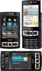
To record audio, for example my pod cast episodes, I used a Nokia N95 8gb. This has an intergrated voice recorded. As well as this it has Bluetooth connectivity, so that files can be sent directly to the Macs, quickly and without the hassle of wires. From this you are able to upload the files from the Blogger via archive.
With our DV camcorders no footage would have been taken. The ones give were not the best pieces of equipment, yet in the end it still allowed me to produce a high quality product. These camcorders and be easily connected to Macs or complient PC's, via the use of a firewire cable, so that recently captured footage can be uploaded in minutes.
To upload my story board I used my home printer which has an intergrated scanned, allowing hand drawn documents to be uploaded to the web.
Finally, the Apple Macs. These were another piece of equipment, as without them none of the specialist editing software would have been available for use. PC's were used, however, this tended to be out of school to compile Word and PowerPoint documents, and small tweeks to my blog.
Overall technology has made the course much more convenient, have a more professional aesthetic and feel, and allow anyone to access your work at anytime.
I am extremely proud of my final cut, even though I know that personnally I could have done much better. But in the time I allotted myself, I feel that I reached the highest standards possible. Hopefully this will be reflected in my final grade.


 black.