Sunday 27 December 2009

DVD Finished Image

The finished design is underneath. It was created using Adobe Photoshop 6, from which a template was used for the dimensions of the disc.

This is the link to the site from which the dimensions were downloaded...
http://www.ncimedia.com/duplication/everest_design.html


DVD Printing

To improve the overall aesthetic of my finished product, I though it would be a good idea to design my own disk print and then incorporate it onto my final cut via the use of my home printer.

To establish what to include on my design I took a large range of DVD's and studied the text and information that is included upon them. To hopefully find a common occurrence amongst the information.

The DVD's that I examined are as followed.....


  •  The Dark Knight 
  • The Chronicles Of Riddick
  • A Knights Tale
  • Pirates Of The Caribbean At World's End
  • Lord Of The Rings The Two Towers
  • Bad Boys 2
  • Fast And The Furious Tokyo Drift 
  • Alien vs Predator
  • The Matrix
  • Spiderman 3
From examining these the most common information is listed below.

  • If the DVD is a 2 disc special edition, then it clearly outlines which disk is the feature film and which contains the special features. Done by numbered disks or having it clearly written in text.
  • The DVD logo is printed onto the disk. 
  • Either a region 1 or 2 logo. This is depended on where the DVD has been distributed. A region 2 DVD will only work within Europe, where as region 1 is specific to the US.
  • Copywright protection company logos, such as FACT.
  • A banner clearly stating that the copy is not for rental. This will obviously be the opposite if the DVD is a rental copy.
  • A website address, so that the audience is able to access more information which is relevant to the film that they have purchased.

  • The inclusion of two age certificates. for the UK and for Ireland. In some cases Ireland tends to be higher than the UK rating, as it's run by a different body to the UK.
  • Of course the title of the film.
  • Production and distribution company logos.
  • Distinction codes for this particular DVD.
These are all located upon the face of the disc, which are placed on top of an image which relates/links into the narrative of the film.

There is also a fine banner of text around the edge of DVD discs it tends to include...\

  • Smaller font which is in white so it can appear more distinguishable.
  • This text tends to include
    • Year of release
    • And by which company has the rights reserved.
    • Also a run time is included in terms of minutes.


Monday 21 December 2009

Image Reproduction Rights

To have some form of formal contract a specific document was established for the cast to sign, to agree there commitment to the project.

22149452 Release Form for Media Recording DB Edit A2 Copy height="500" width="100%" > value="http://d1.scribdassets.com/ScribdViewer.swf?document_id=24383373&access_key=key-cpfa0va5jw2rbk6mg4f&page=1&version=1&viewMode=list">            

Institutional Context

Most spoofs in today's cinema tend to be glossy Hollywood productions, with overly inflated budgets. That a small scale A level film maker couldn't even dream about achieving. Certain examples of the types of budgets used in similar films to mine are as followed.


U.S Hits


  • Scary Movie - $19,000,000
  • Naked Gun 2 1/2 - $23,000,000  
  • Epic Movie - $20,000,000
  • Meet The Spartans - $30,000,000


To name a few U.K releases

  • Hot Fuzz - $16,000,000
  • Shaun Of The Dead - $5,000,000
  • Johnny English - $45,000,000


With a minimum of $16,000,000 and a maximum of $45,000,000 from these examples, I would have to set my self at the lower end of the spectrum. If I were to aim to achieve funding. The lowest of these, Shaun of the Dead is likely to be on such a low budget as its a British production, has a lack of special effects and cgi and an un-star studded cast. However due to its vast success its predecessor Hot Fuzz was given a large budget to meet high expectations. Hence the $9,000,000 increase.

Towards the higher end, referring to Johnny English and Meet The Spartans , they will have been given such extortionate budgets due to complex action scenes, a range of locations, the use of computer generated images and special effects and in terms of Johnny English, the use of well known actors including Rowan Atkinson. 

If my idea were good enough there are several methods I could use to distribute my film, in order to gain solid funding.

If my short film were to produced on a large scale then it would most probably be distributed via one of the British film companies. To make its way onto the big screen I would first preview the screening for free at a local film festival. Most probably opting for the Leeds film festival where I would be able to gain feedback from a vast audience for a next to nothing cost. Then I would analyse the feedback and use it in a way to improve my overall production. If the film were to be momentous at the festival and I were to receive some form of recognition I would use this to publicise my project further.


I would then advertise my project towards a low budget film company such as Warp X who would perhaps allow me to produce my film for regional screenings. More or less following in the footsteps of low budget movies such as Billy Elliot, which was produced, on a very low budget yet turned over an enormous grouse profit.


As well as these methods I could use Propeller TV, which is on Sky, channel 195. It is a Chinese owned company that helps to support the short film industry, however now it is expanding into music, comedy, drama, documentaries and lifestyle. To reach out to a wider audience in the UK and through out Europe.

For more information about the company visit....http://www.propellertv.co.uk/index.html

Tuesday 8 December 2009

Stlyes and Affects

As I have mentioned throughout the blog there are several styles that I wish to explore into.
These include the style of Frank Millers Sin City and a cartoon/pop art affect, I chose these as they suit my superhero narrative the most and will help to increase the aesthetic appeal of the production.


As I was not sure upon whether these processes were vialbe I underwent some rearch, via the populer search engine Goolge. After this search I found a You tube link that guides you through the process of creating a Sin City affect using final cut express 4.


  1. Firstly load up Final Cut Express
  2. Then import or load the desired piece of footage or imagery
  3. Once imported move the chosen material onto the timeline
  4. Repeat this with a copy of the material, but placing it directly underneath
  5. Select the first piece, once selected go to the effects tab and choose key and then chroma keyer
  6. Once this has been done it will appear on the viewer
  7. Drag this out of the viewer, as it will provide more ease in use
  8. Click colour selector on the right hand corner of the window
  9. Choose the desired colour that you wish to remain in frame
  10. Then drag out each of the colour spectrum's until all of the selected colour turns black (this particular stage may take some time, to gain the desired effect)
  11. Once pleased select invert
  12. After this double click the second clip ( the one placed beneath)
  13. Go onto the effects tab, scroll down to colour correction and then from this choose colour corrector
  14. Turn the saturation levels to zero and the process is then complete.
This effect is becoming more popular and has recently featured in the video game for Nintendo Wii Mad World


This is an overview following a video instructing a user on how to create a cartoon effect using final cut, which is quite similar to the process above.


  1. Open up Final Cut Express
  2. Import/open the desired movie clip or still image
  3. Then move it onto the time line and create a duplicate
  4. This copy will be positioned directly below the orignal
  5. Select V2 and apply the line art filter
  6. Go to the filters tab and then adjust the line art settings to 0.002 for threshold and 0 for smoothness
  7. Disable V2
  8. Select V1 and then apply the posterize filter
  9. Enable V2 again
  10. Change the composite mode of V2 to overlay. Acesing this via the modify tab, then composite mode and finally overlay
  11. This finishes the process and gives the desired effect.


Below are some examples of using the Sin City affect on a piece of primary footage..


Following this is a piece of test footage including blue as well as red..


Wednesday 25 November 2009

Production Logo


This is my initial production logo. The name Influence Films, was chosen due to the vast amount of inter textual references I am using in my short film production.


This is my second concept. It is exactly the same image however, using feedback is was outlined that I should focus upon the pills and the letters with in it.

Thursday 12 November 2009

Working Title

I cant really decide upon a name for my production, so if you have any suggestions comment away.


No one likes a hero?

This title above is the track name of a band named Ghost of a Thousand.


Thursday 5 November 2009

Podcasts

 Podcast- Episode One


Check out my podcast by choosing either of these two links. The first takes you to a page where you will be able to access all of the uploaded content, where as the bottom links you direct to episode one.


Podcast- Episodes Two And Three


Podcast- Episode Four


Podcast- Final Episode


Monday 19 October 2009

Initial Animatic and Audience Feedback


Audience Feedback


To build upon my initial idea and see if it would be feasible i decided to pitch my initial idea to the class, presenting it by an animatic and the comments of the class are as follows.


  • Overall i  found that the sequence of the misinterpreted  crime should be altered to a mugging as this and build up the suspicion of the narrative.
  • However  the initial concept of a so called illegal exchange could work, as when i comes to the editing stage, effects can be added such as a darkened aesthetic. Or generally play around with the cinematography using the vast catalog that final cut express 4 has to offer.
  • The narrative appears clear and easy to follow, also the twist at the end doesn't appear to baffling.
  • Two comments were made involving the aspects of the costume.
    • Everyone else involved in the film could be dressed in various super-hero costumes  so that appears the norm. It would also feel a bit more like a short film, as they are renown to have normal situations with one aspect tweaked.
    • Have the character dress in normal clothes, and everyone else in outfits, so the protagonist stands out and is against the norm.
  • To make the narrative tie into the various comic book references, it was suggested i use no dialogue and instead insert text boxes in the corner of each frame as well as using speech bubbles. To give it that graphic novel style i could also wash out the colour palette and perhaps only focus upon a certain colour such as red. Finally slightly pixelated images could be used to give it that hand drawn style.
  • A film noir style could also be used to give a more gritty urban feel if the scene were to be set in a city.
  • I found from thi,s that the idea I have come up with could work very well and with development, could allow my idea to turn out well

Friday 16 October 2009

In Depth Analysis Of The Hangover Film Trailer


To brush up on my analytical skills I was set the task of deconstructing a teaser trailer for a film and a short film. The film that I opted to study briefly was ‘The Hangover’. At the beginning of the film the major production logos appear and from the names of the company’s mentioned(Warner Brothers and Legendary Pictures) you can clearly denote that the movie is going to be based on a high budget and will most probably be a box office success. However throughout the rest of the trailer the names of the cast aren’t mentioned, but I think these weren’t included as this was one of the first trailers and the cast was rather low key and for many of the actors this was their first major role. Par Bradley Cooper who made an appearance in Wedding Crashers. Before you get to see any of the footage you hear a diegetic phone ring which signifies that the first scene of the trailer will most probably involve a phone based conversation between two characters. It then progresses into the trailer showing two characters engaged in a phone call with the topic of the conversation having large amounts of narrative enigma. This enigma begins when the male character breaks the news to the female character that her husband to be (Doug) has gone missing; this then poses the question, who is this character? And how did he manage to get separated and lost? During the opening few seconds of the trailer the camera shots tend to be a variety of close-ups and extreme close-ups to emphasize both of the characters emotions towards the situation, giving the preferred reading that this was a stag do gone wrong and that the narrative will most probably be based around getting this character back.

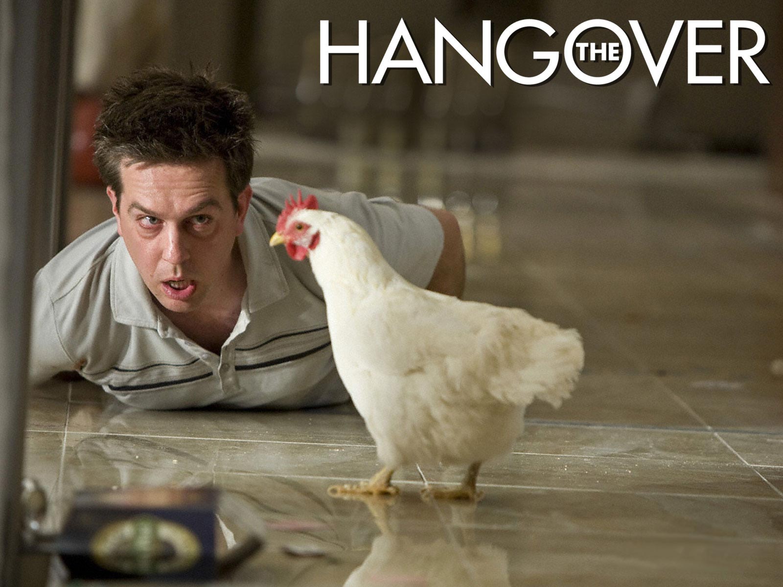
In the next scene of the trailer a non- diegetic editing effect is used to provide exposition on the situation, with the message two days earlier displayed, signifying that something has caused a disruption in the narrative equilibrium to result in the loss of the character Doug. It then switches back to the trailer showing another male character who was shown in the background during the phone call to be laid on the floor, with the camera being placed on a high angle to make him appear more vulnerable. In the same frame there is also a rooster/cockerel,which provides an intertexual reference to the early morning wake up call giving anchorage towards the time of day. As well,as this product placement occurs in the form of a ‘Monster Energy’ drinks can which signifies that the setting is most probably America as this is predominantly an American based product (he tiger placed in the bathroom can be seen as an intertextual reference to Las Vegas due to the mirage hotel is home to the white tigers who partake in a magic show).The accents of the characters and there dress sense provides further anchorage to the setting and nationality of the characters, this being the most popular nationality to use in films as it appeals to a vast audience and the accent is recognisable world wide.

Use of the quote ‘What did we do last night’ signifies that the characters have no recelation of their past events which is a creative method to reveal the plot as the audience have the narrative revealed to them at the same time as the characters. As well as this it creates the preferred reading that the characters underwent a form of activity such as drinking which cause this memory loss. At this stage of the trailer your unaware of where in America the film is set, you have a vague idea that its in the desert however this isn’t accurate enough anchorage and the characters are in a hotel in this area. However with the use of exposition shots, being set in the style of neon lights, it gives the impression of Las Vegas which Is later revealed to be the setting.


From watching the trailer you are given a preferred reading that the film is a comedy, yet this can be contested with there being elements of adventure. This is put across to the audience wit the choice of editing styles in terms of music and camera shots.Convential and creative shots are used to give variety to the trailer such as over the shoulder shots for conversations and the shot when the character missing a tooth looks into the mirror. with this rapid style of editing, it shows that the target audience is the youth market, as its seen as more entertaining and has more youth based themes.

The trailers soundtrack is light hearted ,up beat and fast in tempo(to set the pace of the trailer). It’s also non-orchestral, so no long drawn strings as tension is not needed to be created. In the second half of the trailer the non-diegetic music switches to a power ballad,(by Phil Collins which may be another intertextual reference as one of the main male characters is called Phil)which builds up to, the punch, which is diegetically over emphasized, with this and the use of Mike Tyson in the scene it could possibly be creating an intertextual reference to Las Vegas’s boxing history. Or maybe a new equilibrium forming in the narrative after the character that got punched caused the baby to get hit by the car door (karma). Again narrative enigma occurs, posing the question this time why is Mike Tyson in the room, why did he punch one of the male protagonists and how did he get into the room. Its expected that there would be high amounts of narrative enigma as this is a teaser trailer, as its used to entice the audience to see the film as they will want to know the answers to the gaps in the narrative.

Another way that the audience is drawn in further is with the inclusion of the directors past success hit of ‘Old School’, the inclusion of this information will draw in fans of the film itself and admirers of the comedy style. Throughout this deconstruction of this trailer I’ve been referring to several male protagonists and not named a central protagonist, this is because from watching the trailer the main character appears to be missing and the entire group is shown though out the trailer.

If the commutation were to be applied, would the film have the same affect if the main characters were all female, stereotypically females don’t tend to be as outrageous as men when is comes to pre wedding events therefore in my opinion I feel the narrative may have been a bit more tamer so not to offend.
So to summarise what I interpreted from the clip, the name of the film signifies the narrative, which I found easy to pick up on from watching this clip. Its basically several middle aged American men on a stag do in Las Vegas, which goes terribly wrong due to an excess consumption of alcohol. This causes them to lose the groom, the wife finds out and the film is based around retracing their steps to find out what events they underwent to achieve their goal of finding the groom and getting him to his wedding on time.


Thursday 15 October 2009

Analysis of Short Films And Trailers

Black Hole: Phil and Olly / UK / 2008                                                            
 http://www.youtube.com/watch?v=P5_Msrdg3Hk
  • As its distributed on You Tube by Future Shots its clearly not expected to be a high budget movie.
  • Binary opposition with the white writing and black screen, as well as the name being in white ‘The Black Hole’ and the background being black.
  • Uses a black hole to enter the sequence, which is an innovative and creative editing style.
  • Mid shot – shows characters depressed expression and lazed body posture, with this and the use of a sigh your able to denote that the character is depressed in his current scenario.
  • Creative and original framing with the over the hand shot.
  • Setting is a stereotypical office job
  • Scene appears grey and dark to reflect the characters mood.
  • Narrative enigma, where does the dot appear from and what does it do????
  • Non-diegetic sc-fi sounds denote that there is some form of disturbance in the narrative.
  • Photocopier acts as a reference for the heartbeat speed.
  • Use of CGI so clearly not such a low budget production.
  • Gradual zoom upon the door to focus on what the character see’s.
  • Binary opposition occurs with the characters emotion, going from secluded and depressed to intrigued and greedy.
  • Increase of non-diegetic sound creates tension build up to when he gets locked in the safe.
  • Zoom out in ellipse (time lapse)show clear cut jumps in time, partnered with a zoom out in each cut.
  • Constant setting
  • Slight Dutch tilt, signifying something will go wrong.
  • Product placement with the snickers
  • Narative enigma, why is he by himself and does he get out of the safe alive?????
  • Portrays message that greed can get the better of you.
  • Intertextual reference to the saying curiosity killed the cat.
  • Fast paced editing, represent the target audience – youth.
  • Shot reverse shot to show perspective from in the black hole.
  • Commutation test would it have the same affect if say the central protagonist was a child or a female?


Terminator Salvation: 3 June 2009 Directed by Joseph McGinty Nichol 
http://www.youtube.com/watch?v=CqoDZznScmE
    See full size image
  • Use green banner to show American specified age range.
  • Titles give an edgy electronic feel, which signifies genre of the film will most probably be a sci-fi film.
  • Male has quite a rough accent, which portrays the stereotypical tough guy.
  • Due to themes of the trailer you can sense the age range will be a 12-15 certificate.
  • Exposition is created by the date and the font used for this text signifies a futuristic setting.
  • With the inclusion of a desert landscape and fire you can denote a theme of war emerging.
  • Non-diegetic musics lyrics exposes the narrative. Also the genre of this music taps into the industrial theme which links back to the theme.
  • Christian Bale is emphasized upon to draw in fans of his.
  • Futuristic vehicles create various similitude, so the audience can believe setting.
  • Use intertextual reference with teh use of a motor bike chase, linking to recent hits such as Star Trek, The Dark Knight and Transformers 2. It also links to one of the most famous scenes from Terminator 2.
  • Use a tag line that is familiar to fans of the original series.
  • The first thing to appear in the trailer is a cyborg, allowing fans to immediately recognise the film.
Sweeney Todd the Demon Barber of Fleet Street: 25 January 2008 Directed by Tim Burton
http://www.youtube.com/watch?v=L_hgrfZVlJA
  • See full size image
  • Use minor key non-diegetic to create a sinister mood.
  • Production companies logos are altered to look more gritty and grim by darkening them and adding more shades of grey. This creates a darker feeling towards the film.
  • Use of an orange filter is present to make the scene appear more cheery and happy.
  • Style of the trailer is typical of Tim Burton.
  • Use the names of Producers, Directors e.t.c to break up the scene.
  • Fog can denote London in the past.
  • Font used is a sharp serif style, which anchors the genre which is a drama and refers to the blades which are a key aspect to the narative.
  • Various shots are used of Jonny Dept to reiterate that he is the central protagonist.
  • Elliptical editing is used to show clear cuts over time.
  • Inclusion of Sasha-Baron Cohen to draw in a further audience.
  • Dark humour can be interpreted.


Donnie Darko: 25 October 2002  Directed by Richard Kelly
http://www.youtube.com/watch?v=b6LkdL8THFo
  • There are dream like aspects throughout, which links with the narrative.
  • From watching the trailer it appears strange and can't really be placed into a genre.
  • A range of characters are used to provide the voice over, providing a counter stereotype to the norm of a deep male voice.
  • Lighting is dark and limited when used. This was put into affect to avoid a glamorous aesthetic.
  • Characters are picked for their roles and not to create eye candy.
  • Due to the unknown production companies you can denote that the production was produced on a low budget.
  • An extreme Dutch tilt is used at the start (almost horizontal) to give the proffered reading that this trailer will show a disturbed narrative.
  • Sound bridge is included to link sense with certain shots.
Pound:Directed by Evan Bernard United States - 2007 
http://www.youtube.com/watch?v=MUnStqGJ5FI
  • Simple but effective narrative.
  • Diegetic titles are original and the graffiti style text helps to anchor the setting, which is an urban area.
  • Due to what is going on, on-screen the continuous long shot doesn't appear tedious.
  • Over the shoulder shot proves key during the conversation and provides conventional structure. As well as this it helps to break up the scene.
  • Close ups are used to show necessary details.
  • One continuous setting is used throughout which is typical of a low budget short film.
  • Background colour scheme of red and white could represent binary opposition.
  • Good use of tracking shot to follow characters motion.
  • The central protagonist isn't given away until the end of the film when the same character engages in the same situation.
  • As you reach the end of the clip the variation in shot types becomes more diverse.
  • A flat camera angle is used during the handshake.
  • Stereotypes of gangs in sense if dress, way that the engage in dialogue and the handshake that they are par taking in. To go further into this the accents of the characters is American so LA may be the proffered setting.
  • Dress sense used helps to anchor the times period which the short film is set in.
  • Also the non-diegetic sound throughout is hip hop/rap, which is stereotypically associated with the gang type persona's.
Support: Directed by Borkur Sigthorsson / Iceland / 2008
http://www.youtube.com/watch?v=5_NrUKFhthQ&feature=channel
  • Creative in how the diegetic aspects of the clip set the pace of the clip, for example the the medical drip. This also helps to anchor the setting of a hospital or some form of medical establishment.
  • Binary opposition is used in terms of the non-diegetic music and the narrative. What's appearing in the scene is disturbing however the music played over the top is light and relaxing. Created via the use of major keys being played.
  • There appears to be a contested narrative which I picked up on. You as a viewer have the impression that this man laying in a hospital bed is attempting to pull the plug on himself, yet ends up killings the patients next to him. Therefore the audience can decide whether this was accidental or purposeful.
  • From the narrative, a sense of narrative enigma arises. In that that the audience will want to know why the character is in hospital?
  • Lack of dialogue is an impressive technique used to create suspense.


Super Hero Movie: Directed by Craig Mazin 6 June 2008
http://www.youtube.com/watch?v=VlRuC-eVmu4
  • Use stereotypical deep male voiceover to give a contested reading.
  • Voiceover then switched to central protagonist whom is more light hearted and comical.
  • Uses inter textual references to Spiderman and various other superheros, partnered with what appear to be going on in the frame you can depict the genre is a spoof.
  • Innovative camera work, using car wing mirror to reveal the character.
  • Over exaggerated injuries and accidents.
  • High octane, non-diegetic soundtrack which will appeal to the target audience of youths.
  • Include what else the director has been involved in will draw in fans (directed Scary Movie and Naked Gun, theses films help to anchor the genre of the film), as well as this fans of the inter textual references will be interested.
  • Use editing sequence similar to Spiderman trilogy.
  • Acclaimed actor.
  • Fits with my narrative in how he tries to help someone, yet it then results in the character failing. For example when he attempts to save an old woman from an on coming vehicle, yet in doing so creates for danger for the female character.
  • No one seems to react differently when he is in a superhero costume.
  • Over exaggerated diegetic comedy sounds.

    Scary Movie 4: Directed by David Zucker 13 April 2006 
    http://www.youtube.com/watch?v=h0zAlXr1UOs
    • Use pop culture comedy that a vast audience can relate to.
    • High angles a integrated to show the vulnerability to the giant iPod.
    • Linking text scenes have inter textual references, which are then shown in the next few seconds of the trailer.
    • Again, there is light hearted non-diegetic music, However a more intense build up is used at to establish the trailer, creating an oppositional reading.
    • Crude use of comedy.

    Start Wars In A Note Book: Oscar Triana May 23, 2009 
    http://www.atom.com/funny_videos/sw_notebook/
    • Animation uses captions instead of words. This makes the audience able to decide what the characters personas should be like. As well as this it makes the viewers more aware of what is occurring in the scene.
    • Presented in a childish collage style, to denote the target audience ( young children who have not seen the film or didn’t understand the narrative when they watched it). Hence why the film has been condensed into a three minute clip.
    • Quite advanced editing effects are used to say it’s a short film e.g the use of a realistic explosion. Also with the film being presented via the use of illustration it will have been time consuming.
    • Narrative plays on the idea of how you remember the film when you first saw the big screen production.
    • Director describes the clip as a ‘crazy’ summary by a child who was just seen the film for the first time.


    Angry Kid: Backward Writing: Jul 1, 2003 by Ardman Animation
    http://www.atom.com/funny_videos/angry_kid_writing/
    • Original framing using car mirror to make the characters the focal point of the frame.
    • Stereotypical situation that most can relate to. With the brother, sister rivalry scenario.
    • Comedy used in quite crude, so would most probably appeal to a slightly older audience of around 15-34. Older or younger than this may take offense from the topics.
    • This piece will be recognisable due to its made by Ardman Animation, so fans of their past productions e.g. Wallace and Gromit will be interested in this piece.

    • Dutch tilt is incorporated to signify something is not right.
    • Gritty aesthetic makes the production more socially realistic.
    • High aspects of contrast are used to improve the visual quality.
    • Binary opposition between characters, with one being tall and the other being short. So tall character is emphasized upon more.
    • Sign on the fence is not in English nor is the setting or the race of the characters. With it being set in the desert and the characters are dressed in military style clothing it signifies the modern day conflict issues in the Middle East. Therefore as a viewer you would get the expectation that conflict will most probably occur.
    • Diegetic sound track provided by a radio plays a key role, it aids in building up suspense with the commentators on the radio using the phrase ‘you can feel the tension’.
    • Binary opposition is reiterated and the sense of conflict. Using football team names and then a long shot to reveal the opposing duo who have engaged in conflict denotes the opposing team that is being referred to on the radio.
    • During the stand off radio says ‘are any of these teams going to take it now’. This helps to build the tension further.
    • Close ups are used to reveal emotion.
    • Use of ‘first to shoot first to score’ implies that someone out of the four soldiers are going to engage in combat.
    • Soldiers shoots due to the wrong reason, because of a goal that was offside.
    • Sound is used clearly to make the narrative flow.

    Spiderman 3: Directed by Sam Raimi 4 May 2007
    • Establishing shot pans over the city, with the Chrysler building creating exposition of the New York setting.
    • Bright lights to fade out scene.
    • Full of inter textual references  with the film being based upon a comic book.
    • Throughout the trailer waves are used to create emotion.
    • Editing is set to fit with the beat.
    • 1st person shot is used when showing the mind set of the symbiotic creatures mindset.
    • Binary opposition is used for the character of Spiderman. With him having a duel identity of him being Spiderman and Peter Parker. As well as this there is opposition between the good and evil persona's of the man character.
    • Costume is used as editing an editing technique, allowing fans of the super hero to instantly recognize the film.
    • Interesting transitions, by zooming right into the character Venoms mouth the cut to the next scene.
    Iron Man: Directed by Jon Favreau 2 May 2008 
    http://www.youtube.com/watch?v=DIFaeqwES1Y
    • Marvel logo- fans can know the film is going to be a comic book based production.
    • Fast paced adrenaline pumping non-diegetic music.
    • Use popular culture e.g myspace for publicity.
    • During explosion sequence no sound is used.
    • Creative camera shot. Focussing on a handheld camera screen, which is watching the central protagonist , it then zooms out to reveal what was being captured on the handheld camera.
    • Use elaborate costume.
    • Scene where Tony Stark is undergoing some form of metal working process links with the name of the film.
    • Non-diegetic soundtrack Iron Man by Black Sabbath 
    • Credits are presented in the style of a ironmonger , to relate to the name of the film.


    (In both Spiderman and Iron Man costume is crucial to making the character, who they are.)


    • Use split screen to show the characters alternative motives.
    • Simple title sequence - Plain white text overlying the footage.
    • Binary opposition shown by the split screen. In how one side of the screen life is fine, yet on the other everything is going wrong.
    • Captivating how characters are able to interact with each other. For example the character on the left screen throws an apple which hits character on the right. Also use of the door to make the characters switch sides. On the right the character opens the door , resulting on the character on the left being pushed into the frame on the right by the opening door. Yet the fortune of the characters doesn't change as a result of the switch.
    Incredible Hulk: Directed by Louis Leterrier 13 June 2008
    http://www.youtube.com/watch?v=dUpOhM8Hxx0
    • Slow motion help to emphasize each characters emotion, and seen as the scene has many things going on slowing the speed of the frame down allows the audience to be able to take everything in.

    300: Directed by Zack Snyder 23 March 2007
    http://www.youtube.com/watch?v=0gfZnWVoqZ8
    • Relates back to inter textual reference with its graphic novel style aesthetic.
    • Use interesting, colour pallet which appears washed out. Using a gold tint and super emposing the colour red. 
    • Quirky time lapse (elliptical editing). In the sense how everyone one around the central protagonist are moving at around triple speed where as they male character appears to have been slowed down.
    • 1st person shot is used to navigate around a shopping centre which picks out a certain character. Helping the audience distinguish the central protagonist.
    Black Button
    http://www.youtube.com/watch?v=QrKnhOJ-R80
    • Use Biblical references signifying that religious issues will be involved in the narrative.
    • White background throughout, so it creates a constant sense of narrative enigma. As the audience isn't aware of how the character got into this setting.
    • Non-diegetic soundtrack creates tension, due to the use of long drawn out strings.
    • 180 degree rule is used, so not to break the boundaries of believability.
    • Close ups are used to emphasize key aspects that influence the characters decision. 


    Mankind Is No Island
    http://www.youtube.com/watch?v=ZrDxe9gK8Gk&feature=fvw
    • Shot using a mobile phone, yet still has a reasonable degree of visual quality.
    • Narrative tells itself diegetically, by the camera focusing upon specific words in different situations to create the film.
    • Taken something very simple and over exaggerated it.
    • Even though the narrative is simple you find yourself gripped, because as a viewer you want the scab to be remove as it starts to become irritating.
    • Interesting how the film is able to captivate an audience, this is a key factor to achieve when producing a film.
    • Scab is constantly focused upon as it surrounds the narrative.
    • Start at the end so the rest of the film is revealing what the first scene has led up to .
    • Interesting how the screen splits into four, which then reveals the same character revealing a new peice of dialogue in each frame.
    • Voice overs are effective in the sense of how they are synced perfectly when using the female characters.
    • Off screen violence is used, which is more effective that showing it on screen as it allows the viewer to imagine it themselves. Making an assumption once they hear a gun shot.
    Toy Story: Directed by John Lasseter 22 March 1996
    http://www.youtube.com/watch?v=fPhse4WlgEA&feature=related
    • Creative use of framing, using binocular point of view shot.
    • Interesting how the humans are oblivious to the fact that the toys can move and talk. Which creatives an engrossing narrative.
    • Use monochromatic effect, only showing the colour red, which may be an inter textual reference to Sin City.
    • Intriguing twist- How one male character has a gun to another males head for some period of time, you would then expect him to then shoot this character. Yet another character who you appear to forget about appears back in the frame and kills the male with the gin to end the scene.
    • Also the plot is actually explained during the opening sequence over a phone call, but the sound is drowned out by diegetic sounds, so your unaware of the full situation.
    Deadline
    • Clear exposition, which is provided by specific time and places, which helps to anchor the setting.
    • Fast paced editing and quite over the top narrative makes for easy viewing.
    • Elliptical editing used shows the character getting more aggravated over time.
    • Low angles are used to make the main character appear bigger and more powerful just before he punches the other male character.
    • Wall painting/graffiti is used to create the animation on screen.
    • After watching the short film it makes you wonder how exactly they painted it and the sequences they went though, and the overall time period it took.
    • Similar to most short films, it doesn't seem to boast the awards that's its won, as they aren't included during the end credits.
    • As well as this another common trend it follows is that the cast are not emphasized, this could be for two reasons. Firstly the actors won't be well known so advertising them wont aid in drawing an audience. And secondly it will concentrate the audience on the narrative. 
    Batman: Dark Knight: Directed by Christopher Nolan 24 July 2008
    http://www.youtube.com/watch?v=xxKJgOZXEho
    • Drawn out notes then brisk percussion are used to create tension as the start of the trailer to grip the audience.
    • Logos are flashed upon the screen quickly, so fans will be able to recognise the inter textual reference instantly.
    • Blue tinted lighting used to create a mysterious, spooky ambience.
    Superman Returns: Directed by Bryan Singer 14 July 2006
    http://www.youtube.com/watch?v=v4IOoyrfi0s&feature=related


    • A female voice is used for the short voice over, which is a counter stereotype to the stereotypical deep male voice you mind in most large budget movie trailers.
    • Non-diegetic soundtrack is responsible, as its the soundtrack from the original television series. 
    • High and low angles are used though out to represent certain characters as weak and vulnerable, or super imposed and powerful.
    • Inter textual phrase is used so audience know that the film is Superman.' Is it a bird, is it a plane........'
    • Use aesthetically pleasing production logo. Which all companies strive to achieve, so to make their company easily recognisable.